You’ve made an amazing video, but there’s one thing standing between you and success is your thumbnail. Without the right thumbnail, even the best content can get buried.
Thumbnails are everything. They’re the first thing viewers see, and if they don’t catch attention, your video won’t get clicked.
The problem? Many creators struggle with gaining views, even with great content. In this guide, you’ll discover 10 proven YouTube thumbnail types that will get your videos clicked.
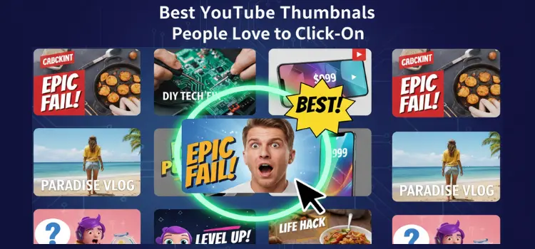
The 10 Best YouTube Thumbnails People Love to Click On
Now, let’s dive into the 10 thumbnail styles that consistently grab attention and get those clicks.
1. Faces with Strong Emotions
Why it works: Humans are naturally drawn to faces, especially when they express strong emotions. Surprise, joy, and shock immediately catch the eye.
Example: MrBeast’s thumbnails, his exaggerated facial expressions pull viewers in right away.
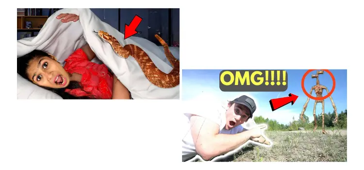
 2. Curiosity-Driven Thumbnails
- Why it works: Thumbnails that spark curiosity make viewers want to know what happens next.
Example: Thumbnails with text like, “You won’t believe what happens next” create intrigue.
 3. High-Contrast, Bold Colors
- Why it works: Bright, bold colors stand out against YouTube’s background, demanding attention.
Example: Thumbnails with striking color combinations like red and white are visually captivating. 4. Minimal Text with Large Fonts
- Why it works: Less is more. Keep the text bold, concise, and easy to read.
Example: Short, punchy words like “5 Mistakes” or “How To” in big, bold fonts are perfect. 5. Before & After (Transformation)
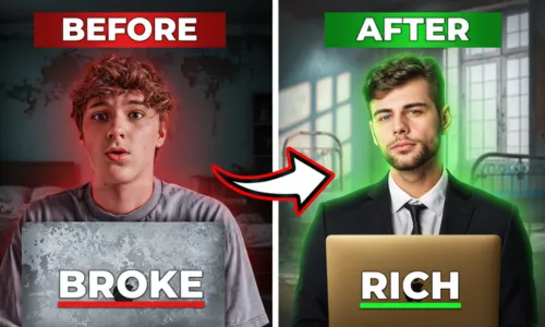
- Why it works: People love transformations — they promise value and make the viewer curious about the change.
Example: Fitness channels or renovation videos showcasing before and after results.
 6. Action Shots
- Why it works: Movement and energy grab attention, especially when it conveys excitement.
Example: Extreme sports or cooking channels showing mid-action shots that make the video feel more dynamic. 7. Bright Backgrounds with Clear Focus
- Why it works: A clean, bright background ensures your subject stands out and doesn’t get lost in clutter.
Example: Thumbnails with white or bright-colored backgrounds where the person or object is the focal point. 8. Thumbnail Consistency (Branding)
- Why it works: Consistent design builds recognition and trust. Use the same font, colors, and layout in all thumbnails.
Example: Channels like TED-Ed or Kurzgesagt use consistent, recognizable thumbnails to build a strong brand.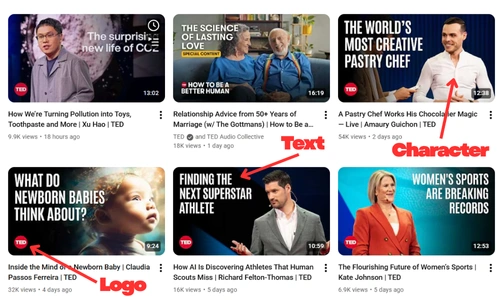 9. Visual Problem and Solution
- Why it works: People love solving problems. Presenting a problem and offering a solution in your thumbnail gets them curious to find out how.
- Example: Tech tutorials with thumbnails like “How to Fix…” get immediate interest.

10. Contrasting Expressions or Split Screens
- Why it works: Contrasting emotions or split screens show a comparison, creating curiosity.
- Example: A comparison between two products or two opposing emotions (e.g., happy vs. sad).

Tips for Designing Your Own High-CTR Thumbnails
Thumbnail Design Tools
Designing high-CTR thumbnails doesn’t require advanced skills. Tools like Canva, Photoshop, or Snappa make it easy to create eye-catching thumbnails. You can also use Vidgent for AI-powered optimization and insights on improving your thumbnails.
Size & Format Tips
Size: YouTube’s ideal thumbnail size is 1280 x 720px (16:9 aspect ratio).
Mobile Optimization: Most users watch YouTube on mobile devices, so make sure your text is legible and your design is mobile-friendly.
Test & Experiment
Always A/B test your thumbnails. Try different designs, colors, and text to see what works best for your audience.
Thumbnail Best Practices
Here’s how you can design a winning thumbnail:
- Use high-contrast colors to grab attention.
- Show expressive faces to draw emotional connection.
- Keep it simple: Focus on one main subject and avoid unnecessary clutter.
Common Thumbnail Mistakes to Avoid
Overcrowding the Image
Too many elements in your thumbnail can distract from the main focus. Keep it simple, clean, and easy to read.
Misleading Thumbnails
Clickbait thumbnails may get you clicks initially, but they can hurt your audience retention and channel reputation. Always make sure your thumbnail matches the content of your video.
Low-Quality Images
Low-resolution images can make your video look unprofessional. Always use high-quality, sharp images for your thumbnails.
Conclusion
To sum it up, creating high-CTR thumbnails is an art form. The key is to balance emotion, curiosity, and branding, while keeping your design clean and simple. Always test, track, and optimize based on what works for your audience.
“A thumbnail isn’t just an image; it’s an advertisement for your content. Perfect it, and the views will follow.”